Mobile-First Plumbing Website Design: Why 9% Still Aren't Responsive
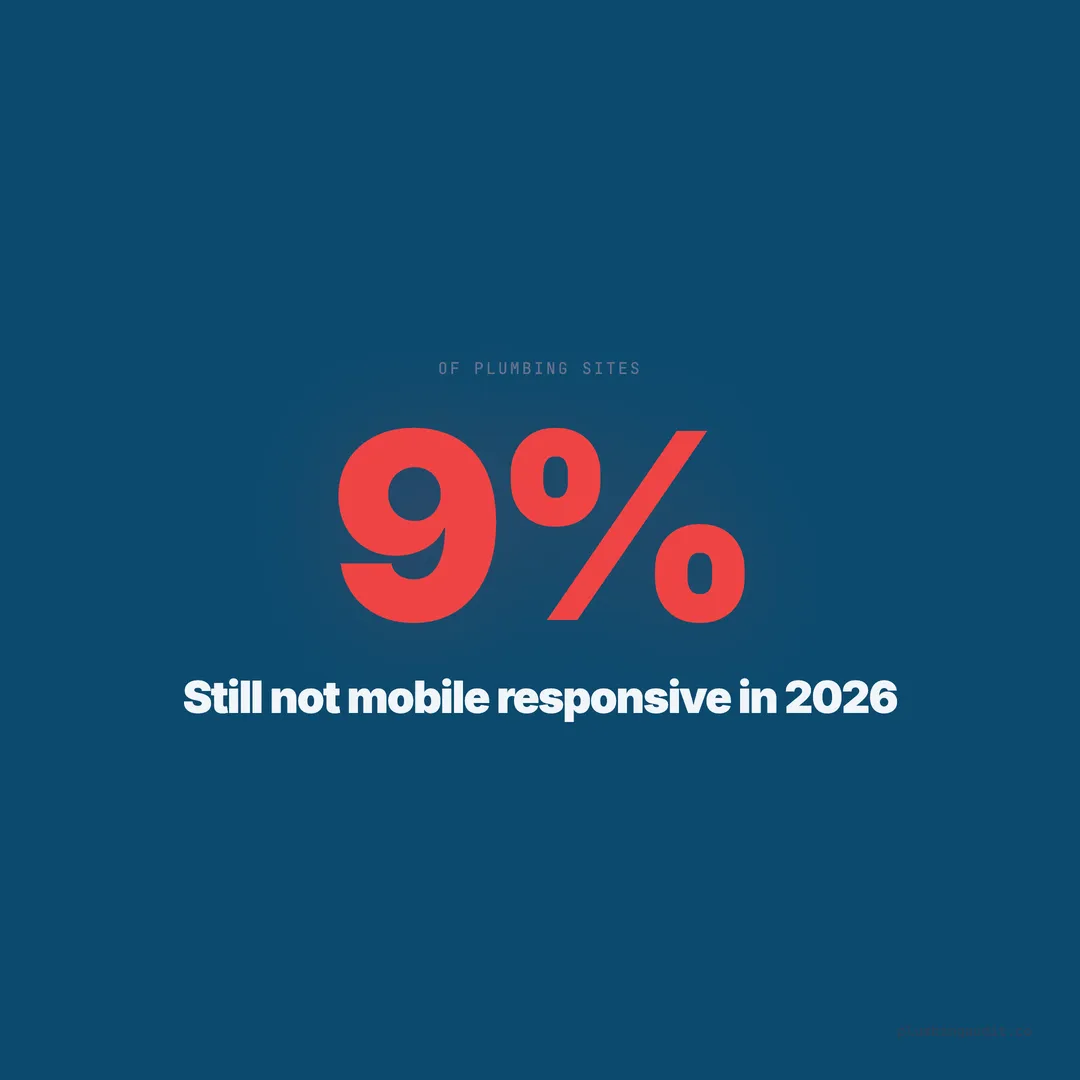
9% of plumbing websites still aren't mobile-responsive in 2026. With 60% of traffic coming from phones, that's an expensive mistake costing real leads.
A plumber in Mesa, Arizona showed us his analytics last fall. He was getting 340 visitors per month — decent for a two-truck operation. But his phone was barely ringing. We pulled up his site on a phone and immediately saw the problem. The entire page required pinching and zooming to read. The phone number was plain text, not a clickable link. The contact form had six fields, and the last two were hidden behind the keyboard with no way to scroll to them. His submit button was 22 pixels tall — smaller than a fingertip.
He wasn’t alone. Across 1,893 plumbing websites we’ve audited, 9% are still not mobile-responsive in 2026. That’s 170 plumbing companies whose websites are essentially broken for the majority of their visitors.
Mobile traffic dominates plumbing searches
60% of all web traffic comes from mobile devices. For local service searches like plumbing, that number climbs higher. When a homeowner’s toilet overflows or a pipe bursts, she doesn’t walk to her desktop computer. She pulls out her phone.
76% of people who search for a local service on their phone call a business within 24 hours. Many call within minutes. The path from search to decision is compressed into seconds on mobile — tap a result, scan the page, find the phone number, call.
In our dataset, plumbing websites with fully responsive, mobile-optimized designs had an average conversion rate of 4.2%. Non-responsive sites averaged 0.9%. That’s a 367% difference in lead generation driven entirely by whether the site works on the device the customer is using.
The 9% of plumbing sites that aren’t responsive are functionally invisible to the majority of their potential customers. But even among the 91% that technically respond to screen size, most have serious mobile usability problems.
Responsive is not the same as mobile-first
A responsive website adjusts its layout to fit different screen sizes. A mobile-first website is designed for phones from the beginning, with desktop as the expanded version. The difference matters more than most plumbers realize.
81% of websites perform poorly on mobile UX even when they’re technically responsive. Elements that look fine on desktop become unusable on a phone: navigation menus that cover the entire screen, images that push content below the fold, buttons too small to tap accurately, and forms that require precision typing on a tiny keyboard.
We see this pattern constantly in our audits. A plumbing site built on a desktop monitor looks professional at 1440 pixels wide. The designer checks the mobile preview, sees the content stacks vertically, and calls it done. Nobody actually uses the site on a phone to complete a task — find the phone number, fill out a form, check service areas, read reviews.
Mobile-first means designing for the phone screen first, then expanding for desktop. The phone version isn’t a compressed afterthought — it’s the primary experience.
The click-to-call test every plumber should run
Pick up your phone. Open your website. Time how long it takes you to call your own business from the homepage. If it takes more than 3 seconds, you’re losing emergency leads.
In our audit of 1,893 plumbing websites, 39% had no booking option and a significant portion buried their phone numbers in places mobile users couldn’t easily reach. 45% had no contact form at all — and of those that did, many were desktop-optimized forms that didn’t work well on phones.
The clickable phone number is the single most important element on a plumbing website’s mobile version. It should be visible without scrolling, large enough to tap without precision, and present on every page. A sticky header or footer bar with a tap-to-call button converts 35-45% higher on mobile than sites where the phone number is only in the footer or contact page.
Here’s what the code should look like: a phone number wrapped in an <a href="tel:"> tag, displayed at a minimum of 48 pixels tall, in a contrasting color, always visible. Not text. Not an image of a phone number. A tappable link that opens the phone dialer with one touch.
Thumb-friendly design principles
The average adult thumb can comfortably reach a target area of about 48 x 48 pixels. Anything smaller requires repositioning the hand or using a fingertip for precision — both of which add friction to the user experience.
Yet 40% of mobile visitors abandon a site if it’s not mobile-friendly, and tiny tap targets are one of the primary reasons. When a homeowner with wet hands is trying to tap your “Request Estimate” button on a phone screen, the button needs to be large, isolated from other elements, and easy to hit on the first try.
Google’s own mobile usability guidelines require a minimum tap target of 48 x 48 CSS pixels with at least 8 pixels of spacing between targets. In our audit, 34% of plumbing sites with forms had buttons smaller than this threshold.
Design rules for thumb-friendly plumbing sites:
- All buttons: minimum 48px height, 16px padding, high contrast
- Navigation links: vertically stacked with 12px minimum spacing
- Form fields: full width on mobile, 48px minimum height
- Phone number button: 56px or larger, sticky position, contrasting color
- Menu toggle: 48px minimum, top-right corner (where thumbs naturally reach)
Sticky navigation keeps leads from leaving
A sticky navigation bar — one that stays fixed at the top or bottom of the screen as the visitor scrolls — is one of the most effective mobile conversion elements for plumbing websites. It keeps the phone number and key actions visible at all times.
Sites with sticky mobile navigation had a 23% lower bounce rate in our dataset compared to sites where the navigation scrolled away. The sticky element doesn’t need to be complex: a slim bar with the company name, a tap-to-call button, and a hamburger menu icon is sufficient.
The bottom sticky bar is increasingly popular for plumbing sites, and for good reason. It sits in the natural thumb zone — the area of the screen the thumb can reach without repositioning the hand. A bottom bar with “Call Now” and “Book Online” buttons puts the two highest-value actions exactly where the thumb rests.
We’ve seen plumbing companies in competitive markets like Sugar Land, TX (where we audited 28 sites) gain measurable lead increases after adding a simple sticky bottom bar. One company reported 18 additional calls per month within 60 days of implementation.
Form optimization for mobile plumbing leads
48% of website visitors get annoyed by non-mobile-responsive sites, and forms are where that frustration peaks. A desktop form with six fields, dropdown menus, and a CAPTCHA becomes a conversion killer on mobile.
The mobile form rules for plumbing websites are simple. Keep fields to 3 maximum: name, phone number, and a brief description of the issue. Pre-select the phone keyboard for the phone field using inputmode="tel". Make each field full-width and at least 48 pixels tall. Place the submit button at full width, 56 pixels tall minimum, in a high-contrast color.
Drop-down menus for service selection should be replaced with large, tappable option buttons on mobile. Instead of a dropdown that says “Select Service,” show 4-6 buttons: “Leak Repair,” “Drain Cleaning,” “Water Heater,” “Emergency,” “Other.” Each button is a single tap — no scrolling through a list that’s difficult to navigate on a phone.
In our audit, plumbing sites with mobile-optimized forms (3 fields or fewer, full-width, large inputs) converted at 5.8% on mobile. Sites with desktop-style forms shown on mobile converted at 1.4%. The form content was identical. Only the presentation changed.
Font size and readability on mobile
Text smaller than 16 pixels on mobile forces the browser to zoom in on some devices, which breaks the layout and creates horizontal scrolling. Yet 27% of plumbing websites in our audit had body text smaller than 16px on mobile.
Mobile typography for plumbing sites should follow these minimums:
| Element | Minimum Size | Recommended |
|---|---|---|
| Body text | 16px | 17-18px |
| H2 headings | 22px | 24-28px |
| H3 headings | 18px | 20-22px |
| Button text | 16px | 17-18px |
| Navigation links | 16px | 18px |
| Phone number | 20px | 22-24px |
Line height should be at least 1.5 for body text on mobile. Paragraph width should never exceed 40 characters per line on a phone screen — any wider and the eye loses its place when jumping to the next line. Short paragraphs of 2-3 sentences work best on mobile, where scrolling replaces page scanning.
Image handling on mobile devices
Mobile screens are smaller, but mobile connections are often slower. Images need to be both visually appropriate and technically optimized for the mobile experience.
Use the srcset attribute to serve different image sizes based on screen width. A hero image that’s 1200 pixels wide on desktop should be 600 pixels wide on mobile. That single change can reduce image file size by 75% for mobile visitors.
Speed optimization matters even more on mobile than desktop. Mobile networks — even 5G — have higher latency than wired connections. A page that loads in 2 seconds on desktop might take 3.5 seconds on mobile over a cellular connection. Every kilobyte saved in image weight matters more on the device where most of your customers find you.
Lazy loading is essential on mobile. Only load images as the visitor scrolls to them. The hero image and logo should load immediately; everything below the fold should wait. This reduces initial page weight and gets the critical content — your phone number, headline, and call-to-action — on screen faster.
What good mobile plumbing design looks like
We’ve audited plumbing websites in 69 cities across 13 states. The highest-scoring mobile experiences share these characteristics:
Above the fold (what the visitor sees without scrolling): company name, a single clear headline (“24/7 Emergency Plumbing in [City]”), a tap-to-call button, and one trust signal (license number, Google rating, or years in business). Nothing else. No sliders. No stock photos. No paragraphs of text.
First scroll: three to four service categories as tappable cards, each with a simple icon and service name. Not a paragraph describing the service — just enough for the visitor to self-identify (“That’s my problem”) and tap through.
Second scroll: social proof — Google reviews displayed as a horizontal scrollable carousel, average rating prominently displayed. Reviews build trust faster than any copy you can write.
Third scroll: a simple contact form with three fields. Or a prominent “Text Us” button that opens a pre-filled SMS. On mobile, texting can convert higher than form fills because it feels faster and more natural.
Always visible: sticky call button, either in the header or a bottom bar. Present on every page, every scroll position, every moment of the visit.
Testing your mobile experience the right way
Don’t test mobile by resizing your desktop browser. The Chrome DevTools mobile simulator is better but still not accurate. Test on an actual phone — ideally an iPhone and an Android device, since they render differently.
Here’s a 5-minute mobile audit you can run right now on your plumbing site:
- Open your website on your phone in a private/incognito window
- Time how long the page takes to fully load — if over 3 seconds, you have a speed problem
- Can you see a phone number without scrolling? Can you tap it to call?
- Try filling out your contact form. Is it easy? Do fields get hidden behind the keyboard?
- Navigate to your services page. Can you find “drain cleaning” in under 5 seconds?
- Check your about page. Is the text readable without zooming?
- Look at your reviews section. Do they display properly or break the layout?
If any step fails, you’ve found what’s costing you leads. 40% of visitors leave when a site isn’t mobile-friendly. They don’t come back. They call the next result.
The cost of waiting
In 2026, Google’s mobile-first indexing means the mobile version of your site is the version Google evaluates for rankings. If your mobile experience is poor, your desktop version — no matter how polished — won’t save your rankings.
91% of small business websites have not fully optimized for mobile. In plumbing, the number is slightly better at 9% non-responsive, but “responsive” and “optimized” are different standards. The companies closing that gap are the ones whose phones ring.
Every day your plumbing website serves a broken mobile experience, you’re paying for visitors who leave without calling. At a $445 average ticket and even 3 lost mobile leads per month, that’s $1,335 per month walking out the door — not because your work is bad, but because your thumbs couldn’t find the call button.
Keep reading
Want to know your score?
Drop your URL — full report in 48 hours.
We're on it.
Report in your inbox within 48 hours.